Your company website is home base for everything you do online. All your social media work, your email marketing, your guest posting – it should all come back to your site.
Because your website is so critical to your marketing success, it makes sense to keep up with the trends that affect it. We talk a lot about search engine optimization trends and best practices. Those are certainly important, but how your site looks to visitors is important, too. How easy your site is to navigate and use is even more important.
The best practices of website design change from time to time, and the ways people expect your site to look and behave shift, too. Even if you aren’t planning a redesign right now, it’s good to know the current trends. That way you’ll be able to tell when your site has gone from “good enough” to really needing a redesign.
These 11 trends range from broad design approaches to smaller design features. Many of them overlap or complement each other. You don’t need to – and maybe even shouldn’t – implement them all, but it’s good to recognize them when you see them.
1. Mobile
This is a design trend so huge it affects every other trend I’ll mention here. Mobile search has now surpassed desktop search. That has major implications for not just design, but for content and even for the types of software that define the design and content.
2. Minimalism
There are many reasons this is more than just a design fad. First, your visitors are overwhelmed and distracted. Paring down their options with a super-clean design focuses their attention. And it makes them more likely to take action.
Minimalism also works well with mobile. It helps the interface fit into a small screen easier. It also should make your site download faster.
The Nielsen Norman Group did a terrific survey of 112 minimalist websites recently. They found the defining features to be:
- flat design
- limited color schemes
- few UI elements
- use of negative space
- dramatic typography
- grid layouts
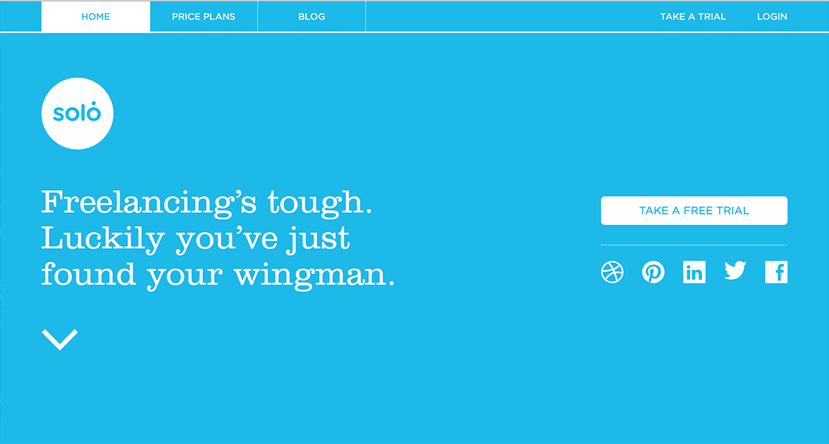
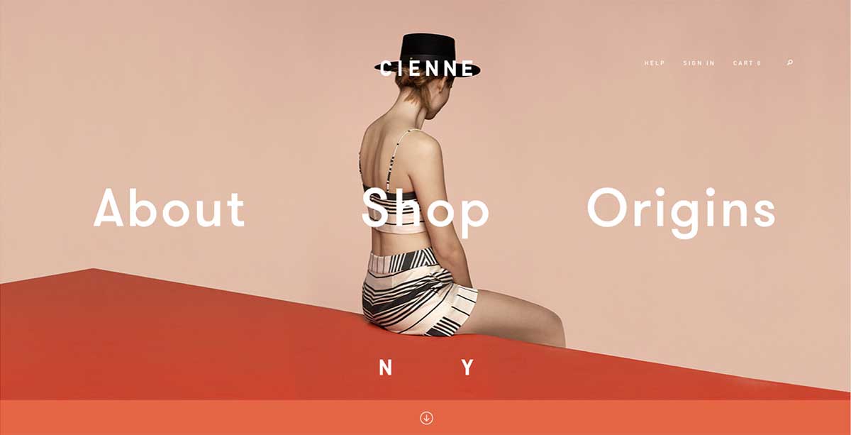
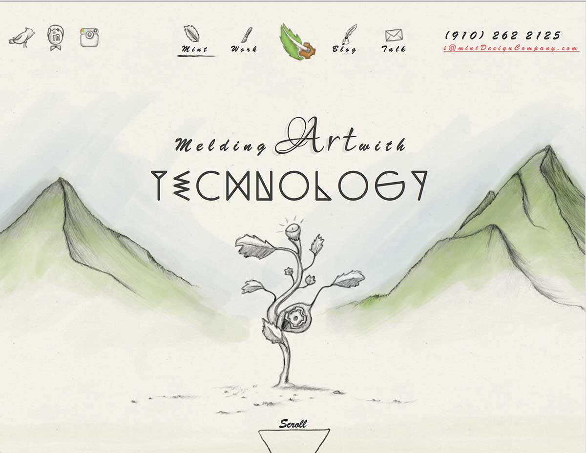
This site below implements a lot of those minimalist elements. Also note that arrow on the left side – that’s a design element that’s appearing on many newly designed sites.
3. Responsive design and adaptive content
I think we’ve all at least heard of responsive design. If you’re not sure what it is, responsive design is how to code and layout a web page so it looks good on all devices. If your website is not using a responsive design by now, it should be.
But there’s also a thing called adaptive content. This is basically making text and images and other content assets adjust to different devices. That usually means text length and image size, but there are other options, too.
We’ve all talked and written a lot about responsive design, but I think we’re only beginning to move into creating adaptive content. One of the biggest ideas in current web design is to no longer create a design first and then make the content fit into it. Instead, you take the content you have and create a design that complements it.
4. Flat design
Almost all of you should know what flat design is. If you don’t, it’s time to learn. Here’s an example:
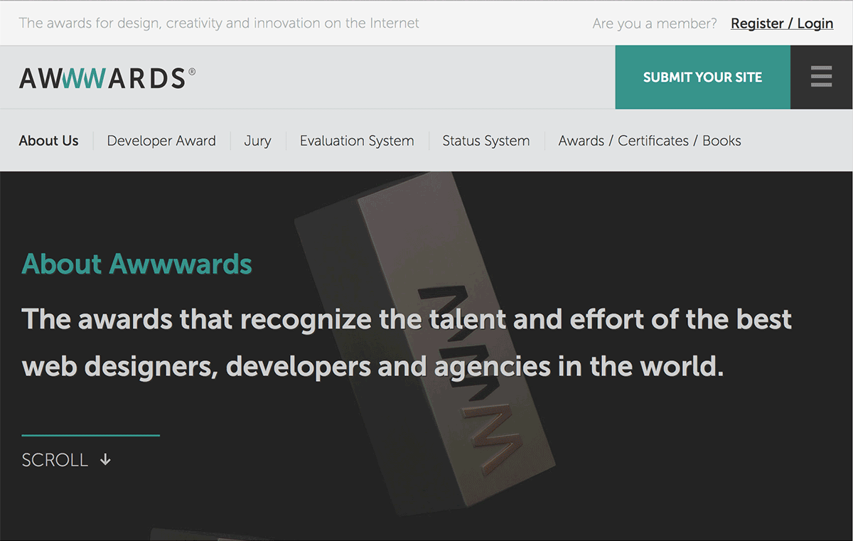
Notice how the images, icons and navigation elements do not try to look three-dimensional? And how there are no drop shadows and very few gradations in color or grays? Those are all hallmarks of flat design.
But that doesn’t mean you can’t have a photograph. Here’s another example of a site that’s considered to have flat design.
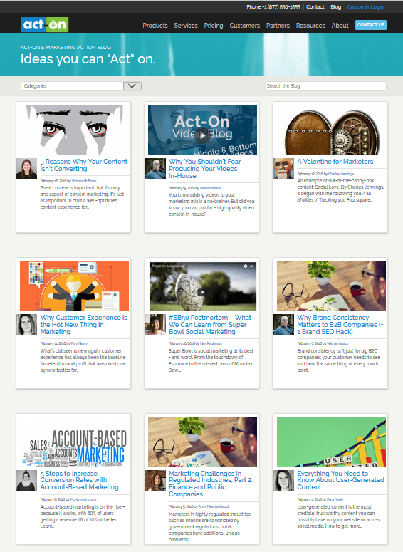
5. Grid design
This trend was mostly spawned by Pinterest, though a grid approach to design in any medium has been around for decades. Sometimes called “Pinteresty” or “cards”, the grid design approach can be an elegant way to offer an array of choices. It’s good for product listing pages, eBook and whitepaper listing pages, and often even as a homepage design.
Here’s how we’re considering using grid design on the Act-On blog home page:
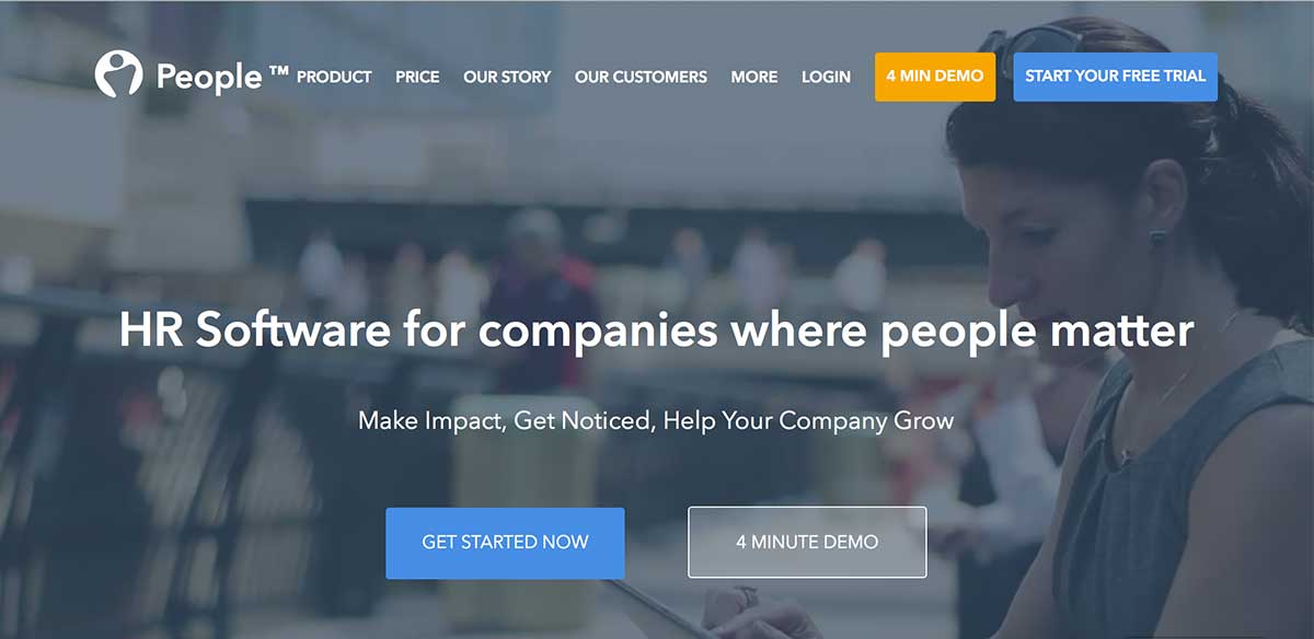
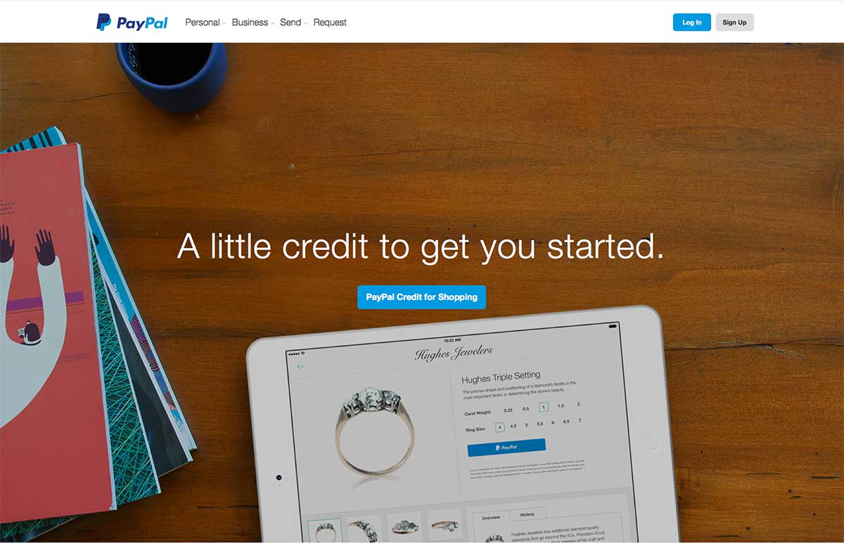
6. Background images and videos
I am sure you’ve seen these. They’re everywhere… they’re one of the design trends that have some designers saying all sites are starting to look alike. But these might be so ubiquitous for a reason: They get people to look longer than they might otherwise have.
If the video moves in the right way, or the image is cropped just right, it can draw the eye to a certain area of the page. Like to an opt-in box. See PeopleHr’s home page as an example of a video background that pulls your view toward the opt-in form.
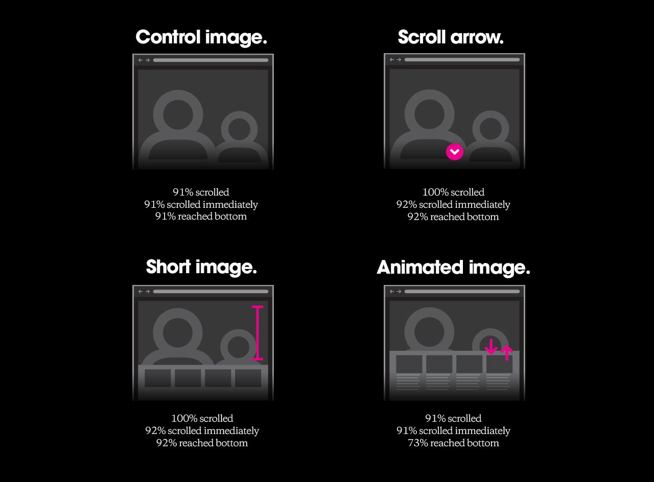
So is it best to use an image or a video, or one large image and a bunch of smaller images? Actually it doesn’t seem to matter much, at least according to a test Huge Inc did. They saw suppressed scroll rates only when an animated image was used:
One thing to note about background visuals … often they use text overlays in white knocked-out type. While designers love “reverse” or “knocked out” type, conversion specialists and direct response people don’t like it.
Reverse type that’s any more than a short headline or a tagline is hard to read. It also suppresses reading comprehension badly, as one Australian publisher discovered when he ran a test.
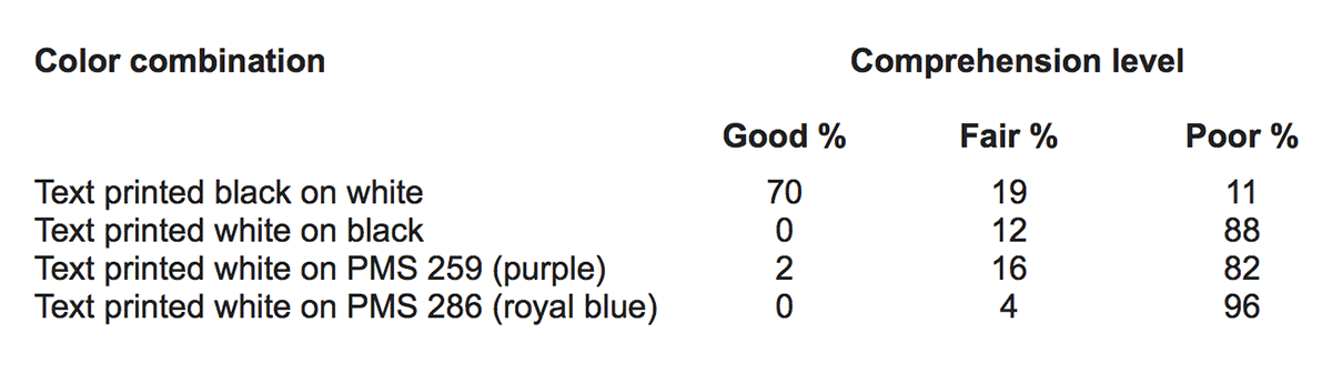
This is about as much reverse type as you want to have:
7. Infinite scroll
This is so widely used that it’s barely a trend anymore. It’s standard web design convention. That’s not always a good thing. Truth be told, I dislike infinite scrolling intensely. It’s because as I scroll, the page skips – so I don’t see all the pieces of information, I only see segments of them. When I’m looking for something on a scrolling page, I have to scroll up and down, bit by bit, very carefully. It takes a lot of effort to make sure I didn’t miss something when the infinite scroll decides to skip.
Ends up I’m not alone in my frustration. The Nielsen Norman Group published an article recently that summarizes the problem:
Endless scrolling saves people from having to attend to the mechanics of pagination in browsing tasks, but is not a good choice for websites that support goal-oriented finding tasks.
I scroll as a goal-oriented finding task. Infinite scrolling makes that hard.
8. Interactive content
We’ve come a long way from the “brochureware” of a decade ago, but many sites haven’t come as far as they could.
There are business reasons for embracing interactive content. First, it increases time on site. In the case of polls and quizzes, it can also give you valuable insights about your audience.
This is a trend worth following up on. If it’s well implemented, adding interactive content could get you a nice lift in revenue and other key metrics.
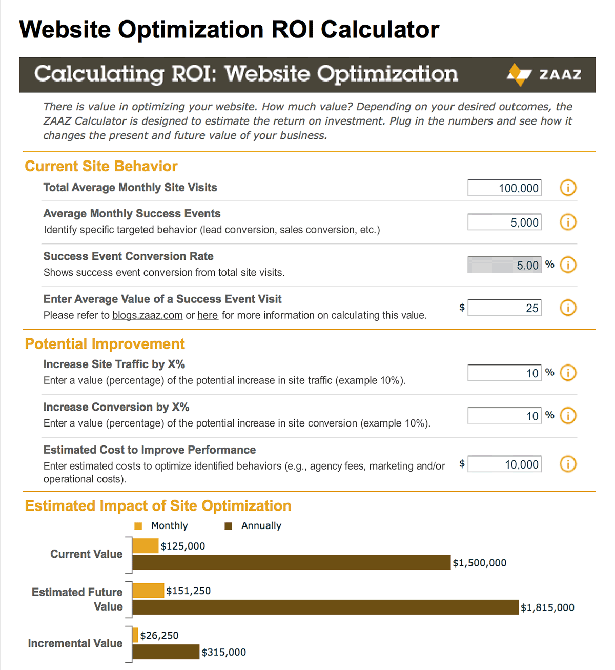
The best interactive content for B2B marketers might be calculators and self-assessment tools. These are ideal for the late stages of the buying process. They can help prospects figure out which service is appropriate to them, and even give them a rough estimate of cost.
ClickZ’s Website Optimization ROI Calculator is a lovely example of interactive content:
9. Movement
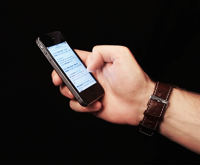
This is the sister trend to interactive content. Movement takes a lot of forms, the most obvious being video. Another example would be the animated gifs you see on some blogs. While some of these may be too edgy for a B2B blog, it’s good to stretch a little once in awhile. Especially if the animated gif drives a point home in a way that words – or even a static image – never could. Just use them with some skill. You want an effect as classy as a cinemagraph, not something like a flashing neon liquor store sign.
or
10. Custom photography and illustrations
There are a lot of voices in the design world just railing against stock photos. I’m not sure they’re as bad as some people say, but there are definitely risks to using stock photography. First, other people could use the same photos you did. And second, photos of real people have been shown to get higher conversions. Why? Because they’re more believable.
A parallel idea to this is custom illustrations. These can do a lot to make your site look original. One of the big problems with many of these design trends is that they’ve been almost too widely embraced. Many sites are starting to look the same, or at least like they’re using the same template, with just swapping text and images. Hand-drawn sites switch this up. So do custom fonts.
11. Hidden navigation
This is another result of the influence mobile is having on all web design. These hidden navigation menus look like a small icon until you mouse over them or click on them. Then they pop up and show their content.
Some sites, like Act-On’s, use hidden navigation in a responsive way. If someone sees the site on a mobile device or has a narrow desktop browser window, they will see the collapsed navigation:

If they click on the three bars, they’ll see the navigation laid out like it was in a sidebar:
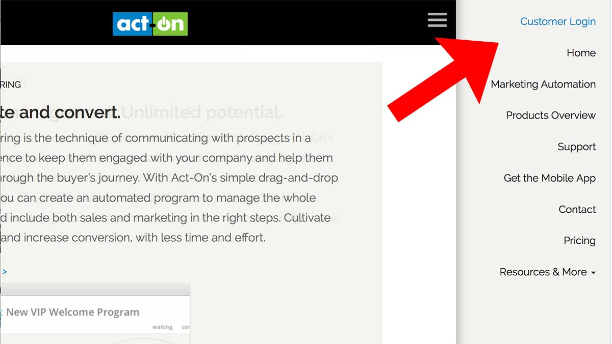
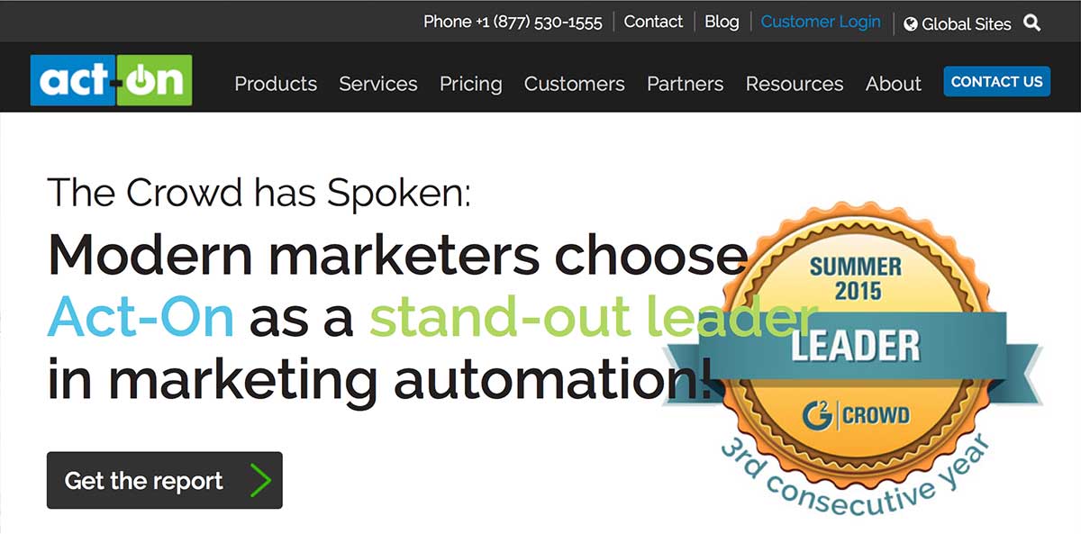
If their browser window is wide enough, they will see the full navigation:
There’s another trend related to this: Anchored navigation. This refers to a navigation bar that follows you as you scroll down the page. Overlays are an example of anchored navigation. Those social media buttons that follow you as you scroll down a blog post are also anchored.
Back to you
Those are the major trends in web design as of right now. But design evolves, and web design evolves fast. If you are thinking about redesigning your website, or are just collecting ideas until you’re ready for a redesign, be sure to follow web design trends that support usability and conversions. Always focus on your users – your customers and prospects. Just because a design element is in style doesn’t necessarily make it good for business.
And as Steve Jobs said: “Design is not just what it looks like. Design is how it works.”
One last thing.
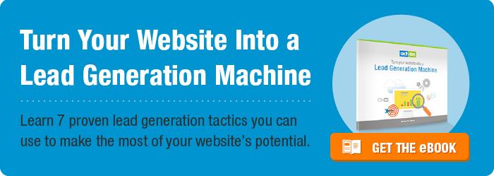
Design evolves, and web design evolves fast. If you’re thinking about redesigning your website, or are just collecting ideas until you’re ready for a redesign, be sure to follow web design trends that support usability and conversions, and read Act-On’s eBook, Turn Your Website Into a Lead Generation Machine, to make sure you aren’t missing opportunities to generate leads as you change the design of your website.
And most importantly, always focus on your users – your customers and prospects. Just because a design element is in style doesn’t necessarily make it good for business.