
When used correctly, forms can be one of the most important tools in your lead generation strategy; for many organizations, forms are the #1 way to capture leads on websites. The main purpose of a form is to get permission to interact and continue to engage with a potential customer, gain insightful information on that prospect, and let you prioritize and score a lead’s attributes (such as title) and actions (such as downloading a solution-focused white paper).
Proper form creation can have a huge impact on conversion rates, and will ultimately help you get more qualified leads in the hands of your sales team. In terms of design and layout, there are many factors to consider, but using a number of the following best practices will help you create user-friendly forms for lead generation that motivate individuals to hit the submit button – and after all, getting a submission is the first goal for any form.

Let the reader know what’s in it for them
- Provide a clear and concise explanation for why the reader is filling out the form.
- Explain what they get in return for completing the form, and use a heading and sub-heading to help describe the benefits of filling it out.
Strong call to action
- Whether you’re linking to a form from an email, web page, landing page, or social media, you want to make sure readers know what the value proposition is and what they get by completing the form.
- Make sure that you’re clear about what you’re asking for throughout the form. If someone is confused at any point while completing the form, there’s a high likelihood that they won’t complete the form, or will enter bogus information.
Placement
- If your form is on your website, keep it high enough so that it can be seen without having to scroll down.
- If you’re linking to a form in an email, the call to action should focus on the form and the benefits of completing it.
- Draw attention to forms with buttons containing direct messages. All buttons should be large and colorful enough to get the attention of visitors.
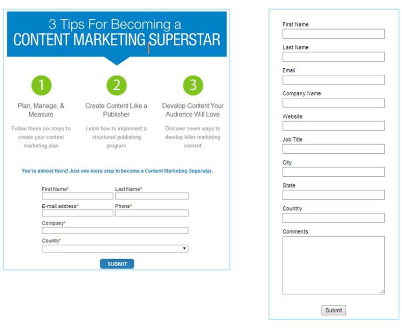
Shorter forms are usually better
- We’ve conducted numerous A/B tests to determine if a long or short form will convert better. In all cases, the short version has won. However, make sure it’s still long enough to collect the information you need – a form that asks only for a name and email will not be as useful as one that also asks for a phone number and company name. Leads might also avoid filling out a suspiciously short form for fear of being spammed.
- That said, the people who fill out longer forms may be more motivated, so while you may get fewer leads, they may be better quality.
- Use your marketing automation system to save contact data each time a lead fills out a form. The next time the same lead fills out a form, the data they have already provided should pre-fill. This prevents the user from having to manually enter data that they may have already provided in the past, and makes you look smart, like you know who they are. (Which you do.)
- If possible, use progressive profiling to gradually obtain more data on each lead who fills out one of your forms. For example, the first time someone visits a form, you may only ask for three pieces of information (name, email and phone). Upon the next visit, you then populate a form that asks for company and title. This helps to ensure that the form remains short, but still allows you to gradually gain increasingly relevant information on the individual submitting the form.
- People are often turned away by lengthy forms that ask for more information than the submitter is willing to give; progressive profiling will get you to your goal of more complete information without taxing the buyer’s patience or arousing mistrust.
- Here are a few qualities that might help you spot a bad form in need of some fixes:
o No heading or sub heading
o No branding
o No value proposition to persuade people to submit the form
o Too long, without using side-by-side text to limit the need to scroll.
Which form would you rather fill out?
Include your privacy policy
- A simple link to your organization’s privacy policy and a promise that none of the lead’s personally identifiable information (PII) will be passed to third-party websites will help build trust with those completing the form. (Of course, do follow through on this guarantee – nobody likes spam!) Read Act-On’s privacy policy.
Test, test, test
- Preview your form in multiple browser windows to make sure it works across the board. Don’t skip previewing the form on mobile devices; 47% of emails are opened on mobile devices now, and people reading email on their phones and tablets will be more likely to fill out a form that is mobile-compatible.
- Test-submit the form to find any process flaws, and make sure the flow is as designed.
- A/B test to identify which of your forms has the best conversion rate. Test many different variables, such as form length, combination and order of questions, wording, and graphic design. Test just one
Follow up
- Make sure you follow up as quickly as possible (usually within 24 hours) if you are using the form for lead generation purposes. Leads go cold quickly.
- Most important: make sure form submitters do indeed get what they were promised by submitting the form. This is a chance to begin building a trusted relationship. Don’t blow it.
Do you need/want a Captcha?
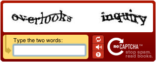 Probably not. The acronym CAPTCHA (Completely Automated Public Turing Test To Tell Computers and Humans Apart) was coined in 2000 by Luis von Ahn, Manuel Blum, Nicholas Hopper and John Langford of Carnegie Mellon University. Such programs create and grade little tests that humans can pass but current computer programs cannot. They’re mostly used in these situations:
- Preventing spambots/adbots from signing up on forums or taking part in online polls
- Protecting rich multi-media downloads from automated access by bots (which is not a security risk, but a bandwidth drain)
We don’t recommend them unless you fulfill certain conditions; it’s just one more field to fill out, one more chance the submitter will lose patience and click away.
Read more about how to capture new customers with forms here.
What’s the worst or most annoying form you’ve ever seen (besides an IRS form)?