You’ve built the perfect offer. You’ve crafted the ideal email, which will go out to your own fabulous list and your new channel partner’s very fresh one. Now you need to give those eager buyers a landing page that will give them what they really want: a short, targeted path to conversion. Here’s how to produce the perfect landing page.

Develop a short creative brief
Know exactly what you want, and pin down any variables. Develop a short creative brief that specifies the landing page’s objectives, target audience, primary offer, headline, supporting copy, images, and form requirements. If you’re working with a designer, use this creative brief as a way to articulate your requirements.
Use other landing pages for inspiration
Reference other pages that you think can serve as inspiration for the page you’re about to design. It’s almost always better to reference an existing landing page when designing a new one. Remember that Albert Einstein quote? “Creativity is the art of hiding your sources.”
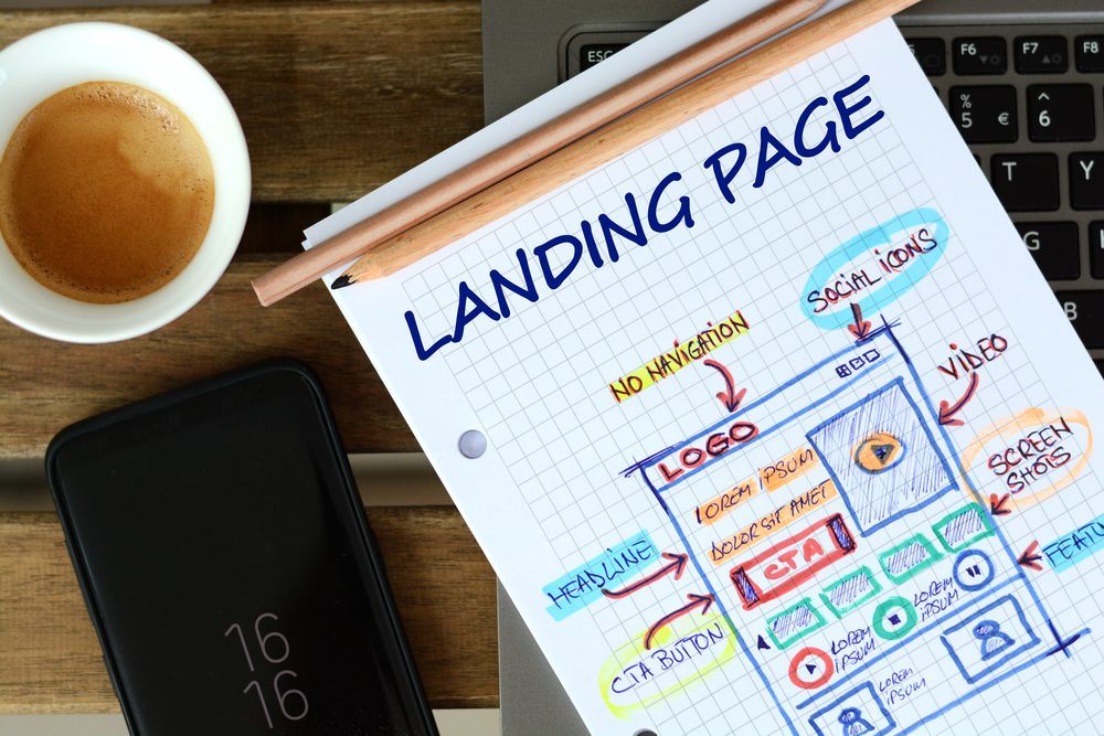
Block out the overall structure of your landing page
Block out the overall structure of the page using a simple wireframing tool or even PowerPoint. You’re not creating a final design here – you’re just playing with the elements of the overall layout to make sure that the page makes sense. If you’re working with a designer, this will serve as a way to indicate your expectations.
Make the form pop off the page
Lay out the page so that the form and call to action pop. Place the form above the fold and use a color treatment for the form that contrasts with the rest of the page.
Design a high-impact headline
Use a high impact font treatment to highlight the page headline. The headline needs to grab the attention of the prospect and clearly articulate the value they’ll receive in exchange for completing the form. But be sure to use web-safe fonts, so you can be confident people see the page as you intend.
Point everything at the form
Make sure that each element on the page guides the prospect to the form. For example, you can use visual cues such as arrows that direct the prospect’s gaze to the form and call to action.
Design your form button
Pay particularly close attention to the design of your form button. Use a color treatment such as green, red, or orange, as well as a bold, impactful font.
Use bullet points to organize copy
Remember: prospects won’t read your landing page – they’ll scan it. So make it easy to consume by using bullet points made up of one high-impact sentence each. Don’t try to say everything; pick the three points that matter most to your buyers.
Use plenty of white space
Make sure that there is plenty of white space on the landing page so that prospects can easily consume the information you’re presenting. Use enough white space so that prospects can scan the page and quickly identify the headline and form in particular.
Minimize the number of links on the page
Minimize the number of links on the page so that prospects can focus on the form and call to action. In fact, some landing pages have no links.
If appropriate, showcase a happy customer
You may be able to incorporate a “hero shot” into the page that showcases a happy customer. Make sure the image is high quality and, if possible, align the image so that Happy Customer’s gaze is directed towards the form. You can also use another type of image such as a picture of your product, but make sure it’s related to the primary offer. If your product is intangible or industrial, you may need to get creative with other types of images that provide an emotional connection.
Got all that? Ready, set, go – for an effective landing page that converts.
