In the era of Mad Men marketers knew exactly how their work would be consumed. The target audience would see the ad on TV, hear it on radio, see it in a magazine or on a billboard, and perhaps it would come in the (snail) mailbox. If you planned a print ad or a mail piece you knew the exact size of real estate you were designing for, and you optimized your ad to fit that space. The consumer would see that content exactly how you imagined it when you designed it.
If Peggy Olson were designing an ad today she’d have to consider the context of how that ad would be viewed, and how her target audience would interact with it. There would be no guarantee that her work would be viewed in the way she had imagined, so she’d need to optimize her layout and design so it had impact no matter how it was viewed. She’d have to make sure the call to action (CTA) was clear, concise, and decipherable – even on a three-inch screen.
Designing web pages, landing pages and emails today is a lot more complicated than it was in the days of Mad Men. Today you have the added dimension of interactive elements, and not knowing on which device the content will be viewed. A layout that looks perfect on a full-size computer screen could be a complete mess when viewed on a tablet or a smart phone. A CTA that is unclear or placed in the wrong spot can kill your engagement rate.
Three key interactive design best practices
Most consumers today have the attention span of a gnat. You have about two seconds to hook them when they hit your content before they decide whether or not to click on to something more interesting. It is imperative that you understand these three concepts when you design an email, landing page or web page:
- How layout affects engagement: Learn how to layout elements on a page for maximum engagement
- How content affects engagement: Know what will compel me to interact with your content
- How important time is: You have two seconds to get my attention
Sounds simple, right? If it were that simple I wouldn’t be writing this! I can’t tell you how many pieces of content I come across on a daily basis that frustrate me to the point of just hitting the Back button. I’m talking large corporations with deep pockets, but no design sense.
So let’s get practical. Read on for some very simple tips that will help you optimize your page layouts for engagement on any platform.
How the eye scans a page
The first thing you need to understand is how the human eye tracks across a piece of content. When I was studying advertising in college we were told the eye tracked across a page in the form of a capital Z, starting in the upper left. I’m sure this theory was devised by a study that had some test subject looking at pieces of content while a guy in a white coat tried to draw the pattern of eye movements on a piece of paper. This was long before the now widely available heat map technology that is used to see how people track across pages viewed online. And, mind you, people scan print slightly differently than online content.
The consensus these days is that the eye tracks in a capital F pattern when viewing a piece of content online, still starting in the upper left. Your eye normally tracks horizontally across the top bar of the F first, then the second bar of the F, and finally from top to bottom down the vertical stem of the F.
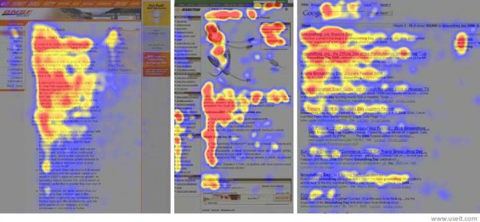
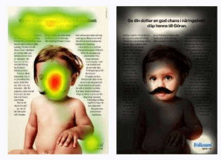
So what does this mean? It means your CTA needs to be somewhere in that capital F pattern, or you need to put a mustache on a baby. Make a conscious design decision to put your main CTA in a spot where it will catch the viewer’s eye in the first two seconds.
Real design disasters
So let’s take a look at a real design disaster that one of my colleagues here at Act-On helped me create. I’m sorry to say that the example below is pulled from real content I came across online. I have used a fictitious company called Actomatic to demonstrate the most common mistakes people make, and how to correct them.
Example 1: Don’t make me scroll to see the CTA
The most common missed opportunity I see is a piece of content with either no way to share or share buttons that are buried at the bottom of the page below the fold. The fold is that imaginary line at the bottom of your screen. (The term comes from the days when newspapers were folded in half; “above the fold” was better placement, with better readership.) On an average-size laptop screen the fold may be 480 pixels from the top of the screen, but on an iPhone it may be at 100 pixels from the top. Be aware of this when you layout your page content.
If we’re talking about a blog or a multi-page article I would venture to guess that most people are ready to share after they read the headline (if it’s good) and the first two sentences of a piece of content, because they want to be first out of the gate. People like to share fresh content, not content they’ve already seen shared by their peers five times.
I suggest having share buttons at the top and the bottom of the content, or share buttons that float alongside the content when you scroll.
I worked with a very well-known company that found, when they added share buttons to the top of an article as well as at the bottom, the share rate went up over 400%.
Example 2: Oh, my eyes!
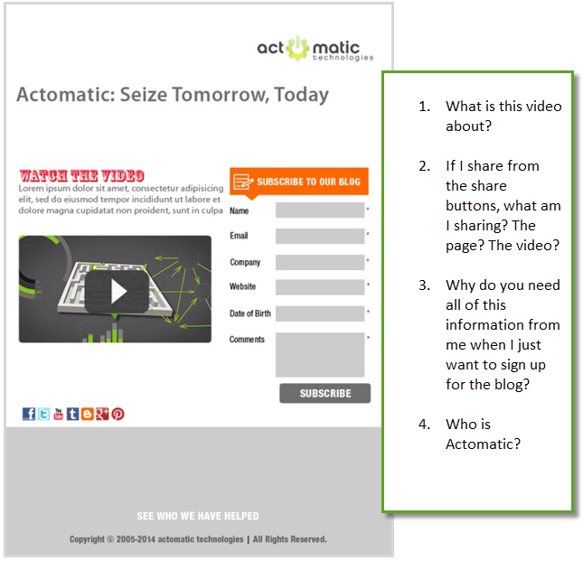
Have you ever landed on a piece of content that was so busy that you didn’t know where to look? Maybe it had a video to share, a form to fill out, some copy, a few links here and there. If I landed on the page below I wouldn’t know where to start so I probably wouldn’t engage at all. This example gives me no indication of what’s most important on this page. You have two seconds or less to catch my attention and engage me, and you just lost me.
If you have multiple CTAs, make it very clear what the logical order of those elements is. Spell it out with numbered callouts if you have to. If I came to this page I would be asking these questions:
The layout looks unplanned and sloppy with random white space and odd fonts. The CTAs are definitely below the fold.
If I were giving advice to Actomatic I would start by asking them what they were hoping to achieve with this page. What is the goal here? I assume the main goals here are to get people to sign up for the blog, and watch and share a short video. If that’s the case, then we need to make some changes.
- Make sure the main CTA is above the fold. Both the share buttons and the Subscribe button are below the fold.
- Make it clear that you would like visitors to sign up for the blog AND share the video
- Add some information about the company
OK, let’s take a look now:
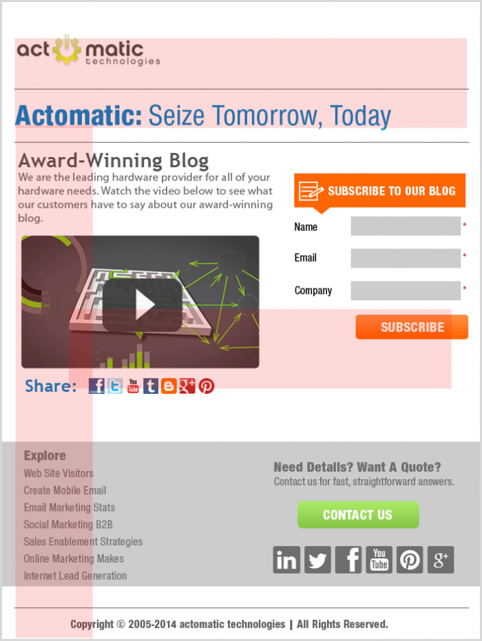
The new and improved version has a slightly different layout, fewer fonts, a short blurb about the company and the video, and a lower barrier to subscribe to the blog. I’ve also added links at the bottom and a Contact button. Notice how I optimized the layout to maximize how much information a reader would see in the first two seconds by following the way the eye naturally scans the page. The F pattern theory says this is the order in which the viewer will take in the elements on the page:
- The company logo
- The headlines
- The share and subscribe buttons
- The Explore section at the bottom
Give me a reason to interact
Now that you’ve got your layout all sorted you need to give me a reason to interact with your content. If you want me to fill out a form or share your content there needs to be a compelling reason for me to do so. So let me ask you, what’s in it for me?
If you don’t know the answer to that question you haven’t done your homework.
The main reason people interact with content is because they get some sort of satisfaction out of it emotionally or materially. If your content is good I’ll share it because it makes me look well-informed in front of my peers. I get an ego boost if I’m the first one to find out about a new widget you just released, so of course I’m going to share the fact that I got to see it first.
Maybe you’re a non-profit and your content is a feel-good story about someone who did something extraordinary, I’ll share that content because it makes me feel good and charitable. Offer me a chance to win an iPad if I fill out a form and I’ll be much more likely give you my personal information.
The trick is to know what compels your audience to engage. Is it emotional reward, material reward, or both? Put yourself in their shoes and create an engagement strategy geared toward your audience.
Keep it simple
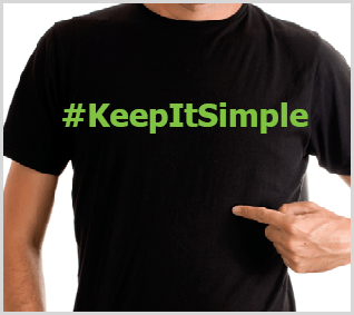 I recently spoke at a conference where I presented a case study of a successfully social marketing campaign. I wore a T-Shirt with this printed on the front: #KeepItSimple. I try to practice what I preach.
I have worked with customers who have created extremely complicated interactive content, and others who have kept it incredibly simple, and the simple wins out almost every time. Here’s how to keep it simple:
- Choose font faces like Trebuchet that are easy to read online.
- Don’t mix too many font faces and sizes on a page. One size for headings, one size for body text.
- Keep it to one clear CTA if possible.
- Keep the important stuff above the fold.
- Make the barrier to entry as low as possible (don’t ask for someone’s first-born child if all you really need is their email address)
Your homework assignment
Wait a minute, you never said there would be homework at the end of this article! If I had told you there would be homework would you have read this far? Uh huh. I would like you to take a look at one of your landing pages with a critical eye and ask yourself if there’s room for improvement.
- View one of your landing pages on a laptop and on a mobile device. Do you have to scroll to get to the CTA? Does it display well on a mobile device?
- Ask a friend who knows nothing about your company to view one of your landing pages, and ask them to give candid feedback while they are viewing it. Ask them to tell you what they notice first, what your company does, and what the main CTA is on the page.
- See if all of the important elements are within the F pattern.
- Test your pages in as many possible browsers on as many possible platforms as possible. Safari doesn’t render elements like Chrome. Firefox doesn’t render elements like Internet Explorer (IE). And different versions of IE can display content completely differently.
You don’t have to have a degree in advertising layout and design to pull this off. But you do have to be willing to look at your current content with a critical eye.
It’s worth the effort.

