In Landing Page Fundamentals part 1, we covered the anatomy of a successful landing page and in part 2 we discussed how to boost conversions on your landing page with great copy and compelling offers. We’ll now conclude this three-part series by showing you how to test and optimize your landing pages.
Based on what you learned in part 1 and 2 of the series, you built your new landing page, fine-tuned the copy, crafted a compelling offer, and created the perfect form. Now it’s time to go on to the next project, right? Wrong.
Testing and optimizing your landing page should be a regular part of your campaign process. You’ll be surprised once in a while, and as you test you’ll understand incrementally more about your audience and what they respond to. More important, even small improvements can mean exponential change when we’re talking about conversions.
To get started, let’s talk a little bit about how you should perform the tests. Then, we’ll discuss different elements to test on your landing page. We’ll also include a few Act-On landing page examples along the way.
How to Test
There are two primary testing methodologies.
A/B Testing
This approach tests one landing page against another landing page. The only difference between the two pages is one single element, such as the color of a download button. This test shows conclusively whether changing that sole element impacts your conversion rate.
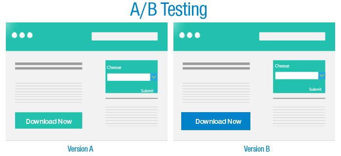
Pros: This is the easiest test to perform and requires fewer resources. It allows you to get insight on how your audience responds to a specific element on your page. In the example above, you would be able to determine if changing the color of your download button increases conversions.
Cons: Since you are testing only one element, A/B testing will not reveal any information about interaction between variables on a single page.
Multivariate Testing
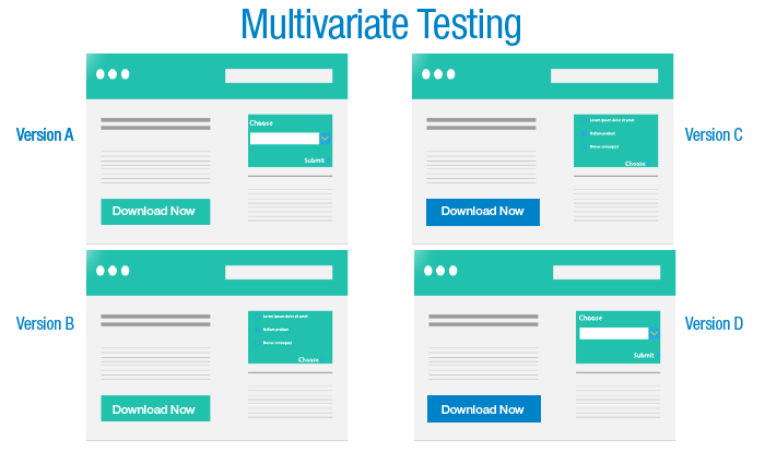
This method is much more complex than A/B testing. It involves testing multiple elements on a landing page in various combinations.
Pros: It can reveal more about how the various elements interact with each other on a landing page. By testing multiple variations, you can determine the best combination of elements on a landing page. In the example above, you would be able to determine which combination of button color and form type creates the best conversion.
Cons: These tests take more resources, as you have to build as many landing page combinations as you want to test. In addition, it requires a larger sample size in order to get enough conversions to determine the outcome.
Testing Tool
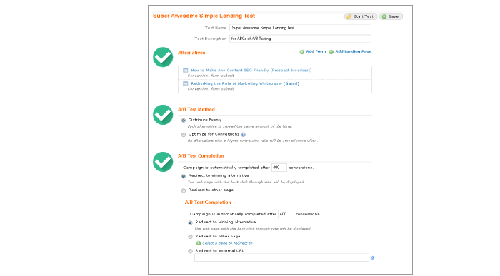
You’ll need a testing tool to carry out your landing page tests. Here a list of the criteria you should be looking for when choosing a testing tool. The right technology should allow you to:
- Easily set up control (A) and alternative (B) landing pages
- Choose your method of testing
- Define testing periods
- Show results and report them
What to Test
Here’s where the fun begins. You can test almost any element on a page. Here are just a few ideas to start with:
Design elements
- Buttons: There are several changes you can make to your current button. Test the size, shape, color, and he placement on the landing page.
- Images: Try testing different types of photos. Does your audience respond better to photos or illustrations? People or product photos? Animated images or static images? Black and white or color? Test a landing page with and without an image. Test video vs.a photo. Test an animated vs. a static GIF.
- Page layout: Move the different elements on the page around to determine if specific layouts create better conversions. Is a form placed on the left or right-hand side better? Should the CTA button be at the top or bottom of the page? Or both?
Copy elements
- Headline: Test different headline copy. Try changing the font size or color. Test using personalization in the headline.
- Body copy: You can test body copy length (in-depth vs. concise) and tone (fun/friendly vs. business/expert.) You can also test different benefit statements to determine which benefits your audience finds valuable.
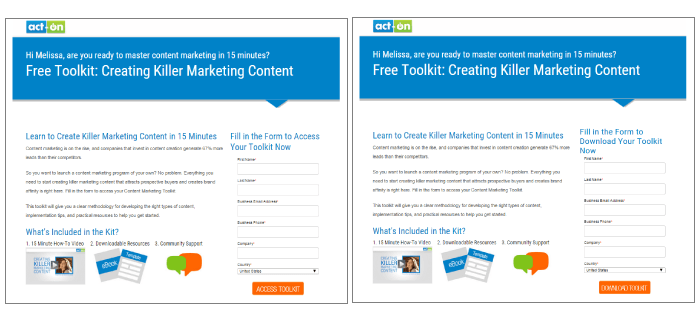
- Call to Action: Test different types of CTAs. Get creative! Instead of “Download Now”, how about trying “Get Your eBook”? “Watch Video” vs. “Take a Tour.” “Free Trial” vs. “Try Me Now.” “Access Toolkit” vs. “Download Toolkit.” Add an exclamation point, or take one away. There are many variations to your current CTAs that might generate more conversions. So take a look and see what alternatives you could test.
Forms
- Number of fields: Test different numbers of submission fields to determine the right amount of fields you need for your forms. The perfect amount will help you reduce “friction” but still allow you to get enough data for your sales team.
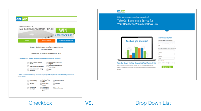
- Type of forms: There are many different form types and some may convert better than others. Try testing forms with a drop down list instead of a check boxes. Multiple choice vs. fill-in forms. Radio buttons vs. check boxes. We’ve found that drop down lists are much easier to submit on mobile, so if your audience is mostly mobile try this type of form.
Offers
Since the offer is often the key determinant of whether the page will convert, this is a prime variable you should test. Testing offers will allow you to determine what your audience finds valuable. If your offer is for a content piece, test to see if your audience prefers eBooks or white papers. If it’s a pricing offer, test whether a percentage discount performs better than a free shipping offer.
Ready, Set, Go!
We’ve covered the main components of a successful landing page and you’ve learned how to write great copy, create compelling offers, and test your landing pages. Now it’s time to have some fun. Remember, creating, testing and then optimizing your landing page should be an ongoing process. So…get ready, set, go!
If you want to learn more about testing both email and landing pages, check out our webinar, “The ABCs of A/B Testing.”

