
As business people and marketers, we traffic in data. It’s what we use to make decisions (even gut decisions). Data is also how we communicate the status of things and how we make the case for change.
As logical, results-oriented business folk, we like to be data-based.
This principle is so prevalent now that it shows up in a number of disciplines. There’s data-driven marketing. Data storytelling. It all ties nicely into the trend of visual content, too.
Yup – all our pie charts and bar graphs are a type of visual content. We even have a nice word to blend data and visual content: “data visualization,” aka, “data viz.”
Given how powerful and ubiquitous data visualization is, wouldn’t you like to be better at it? If so, learn our pie chart best practices and other tips below on how to make your data more convincing.
These proven best practices will help. To keep things short, I’ve limited my suggestions to the two most commonly used data visualization devices: pie charts and bar graphs.
What are Pie Charts Used For?
Pie charts are used to represent data visually as proportional slices of a circular chart, making it easy to compare parts of a whole. Each slice represents a category, and its size corresponds to the percentage or proportion it contributes to the total. They are most effective for displaying simple, limited datasets where the focus is on showing relative sizes or distributions.
Are Pie Charts Bad?
Quite a few data visualization experts are intensely opposed to pie charts. Walter Hickey opens his blog post, “The Worst Chart In The World” with this sentence: “The pie chart is easily the worst way to convey information ever developed in the history of data visualization.”
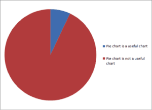
Ouch.
Even Edward Tufte, possibly the most respected voice in data viz, says “pie charts are bad and the only thing worse than one, is lots of them.”
So why are pie charts bad?
Basically, it’s because they’re hard to read. They’re hard to read because our brains aren’t great at interpreting the relevant size of different slices of the pie. If the sections of the chart are similar, we can’t easily tell which piece is bigger.
If you’ve got only two or three slices of the pie, and all those slices are very different, then you don’t have much of a problem. But that’s not the case with most pie charts. All too often, we try to squeeze too much data into them – not only do we end up with lots of slices, we get too many similarly sized slices. That’s when it becomes hard to tell the difference between, say, a slice that’s 23% of the pie versus a slice that’s 28%.
So, is this really such a big deal? Are they really warping our perception so badly?
Well, consider this row of charts. They’re supposed to illustrate changes over time:
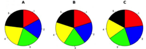
The main takeaway is that it’s difficult to use pie charts to show both the changes over time and how big the different categories are.
Pie Chart Best Practices
Yeah… so pie charts have issues. But I’m guessing you’re still going to have to use them from time to time, whether it’s because your boss said so, or because it’s difficult to depict your information any other way.
So, if you must use one, try to abide by these pie chart best practices:
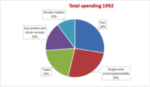
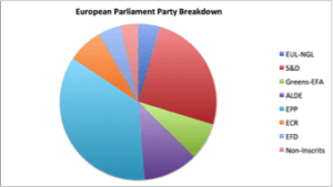
1. Don’t use more than five sections
The most important aspect of pie chart best practices involves the amount of data used. Too many skinny slices are hard to read. They cloud the information as much as they reveal it.
So, do this:
Not this:
2. Place the largest slices from “12” at the top (like on a clock) and work your way around the circle
Like this:
Not this:
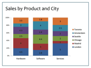
3. Avoid comparing one pie chart to another
Remember that example above, with the three pie charts showing changes over time? That goes again pie chart best practices as it’s not the right time to use them. Because even one pie is hard to read, lining up a row of them for people to compare makes things even worse. If you want to compare two sets of data like that, use a stacked bar chart like this:
4. Don’t use 3-D pie charts
These also go against pie chart best practices as they make some slices of the pie seem larger than others. This makes the chart even harder to read, and possibly downright deceptive.
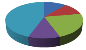
In the example above, the purple slice looks larger than the dark blue slice in the back, but maybe they’re the same size, due to the foreshortening of the blue slice. The angles are hard to measure, too.
I don’t advise this (of course), but if you wanted to manipulate information – to deliberately make that dark blue slice look smaller than the purple slice ‒ a 3D chart could do that well.
When to Use a Pie Chart
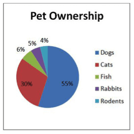
Before you swear off pie charts forever, know this: There is an exception to the no-pie chart rule. Really. The data viz experts say so. When you’ve got 2-3 data points that are significantly different, then it’s fine. You can have your pie at that time. This is the one instance when pie charts are helpful ‒ they’re good at showing people what a fraction of something looks like.
For example, this is a reasonable use of a pie chart:

Common mistakes with bar graphs
After pie charts, the next most common chart we see in business is the bar graph. These are not as reviled as the poor pie chart, but they’re associated with some frequently made mistakes. Here are the worst offenders:
1. Sideways labels
Here’s an example of a bad bar graph with sideways labels:
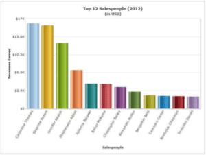
Fortunately, this is an easy fix. Just switch the information on the axis so the long labels can be read horizontally.
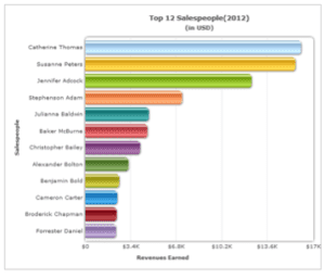
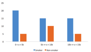
2. Data points aren’t ranked by size
The charts right above don’t break this rule. In both the vertical and horizontal examples, the bars that are longest are up top, and they descend orderly to the shortest bar.
This lends a sense of visual consistency, but more importantly, it makes it much easier to understand how the measurements compare.
A graph like this breaks the rule.
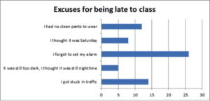
It makes the viewer have to guess or squint to see how often the different excuses are made.
Of course, if you’re using a bar graph to show changes over time, then you should prioritize the time increments and put them in order, rather than forcing the bar lengths to line up.
3. Avoid shadows or 3D elements on your graph
It just distracts from the information. Keep the imagery of any data visualization as simple as humanly possible. You want the star of your information to be the information itself – not anything else.
While I adore Social Media Examiner’s annual industry report, I wish they wouldn’t make their graphs 3D.
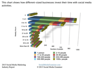
This is a small mistake, but it makes every data visualization experts’ list of no-nos. Those lines behind the bars on a bar graph? They should go. They’re only cluttering up your graph.
So do this:
Instead of this:
The clearer we can communicate our message, the more likely we are to be heard. Pie charts and line graphs can do that ‒ but only in specific circumstances, and only if they’re depicted in a straightforward and clean way. These charts distill a lot of information, but the simpler they appear, the more impactful they become.
Frequently Asked Questions
1. What is a pie chart?
A pie chart is a circular statistical graphic divided into slices, where each slice represents a proportion of a whole. The size of each slice corresponds to the percentage or fraction it contributes to the total dataset, making it easy to visualize and compare parts of a whole. Pie charts are commonly used for simple datasets to show proportions, distributions, or relative sizes among categories.
2. What are the best pie chart alternatives?
The best alternatives to pie charts include:
- Bar Charts: Ideal for comparing individual values across categories with clearer visual precision.
- Stacked Bar Charts: Useful for showing proportions within categories while maintaining total values.
- Column Charts: Similar to bar charts but oriented vertically, good for comparing data across time or categories.
- Donut Charts: A variation of pie charts with a central hole, better for additional labeling.
- Treemaps: Show hierarchical data as nested rectangles, ideal for complex datasets.
- 100% Stacked Bar Charts: Focus on the proportional breakdown of each category.
- Waterfall Charts: Demonstrate cumulative impacts of sequential data changes.
These options improve clarity, especially for complex datasets or when precise comparisons are needed.
3. What are the three limitations of pie charts?
- Difficulty Comparing Similar Sizes: It can be challenging to accurately compare slices that are close in size, reducing clarity in data interpretation.
- Limited Data Categories: They work best with a small number of categories; too many slices can make the chart cluttered and hard to read.
- Lack of Precision: They are less effective at showing precise values or trends compared to bar or line charts, as they rely on visual estimation.
4. How to make pie charts in Google Sheets?
- Enter Data: Open Google Sheets and input your data into two columns: one for categories and one for values.
- Select Data: Highlight the data you want to include in the chart.
- Insert Chart: Click on the Insert menu, then choose Chart.
- Choose Chart Type: In the Chart Editor on the right, select Pie Chart under the Chart Type dropdown.
- Customize: Use the Chart Editor to adjust labels, colors, and other visual elements.
- Save/Export: Once done, save your sheet or export the chart by right-clicking on it.
5. How to Make Pie Charts in Excel?
- Enter Data: Open Excel and input your data in two adjacent columns: one for categories and one for values.
- Select Data: Highlight the data range to be used in the pie chart.
- Insert Chart: Go to the Insert tab, click on the Pie Chart icon in the Charts group, and select a pie chart style (e.g., 2D, 3D).
- Customize: Use the Chart Tools ribbon to modify the title, legend, colors, or labels.
- Save/Export: Save your Excel file or copy the chart for use elsewhere.